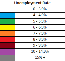
Here is an animated “heat map” that shows how unemployment rates have changed across the state during the recession. While the national recession officially began in late 2007, it didn’t begin to impact West Virginia until late 2008. The map tracks unemployment rates by county from August 2008 to August 2010. As the unemployment rate rises, the colors change from white to green to red to finally gray as the unemployment rate reaches past 15%.

